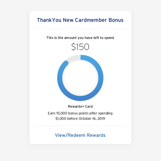
Acquisition Bonus Tracker
Acquisition Bonus Tracker
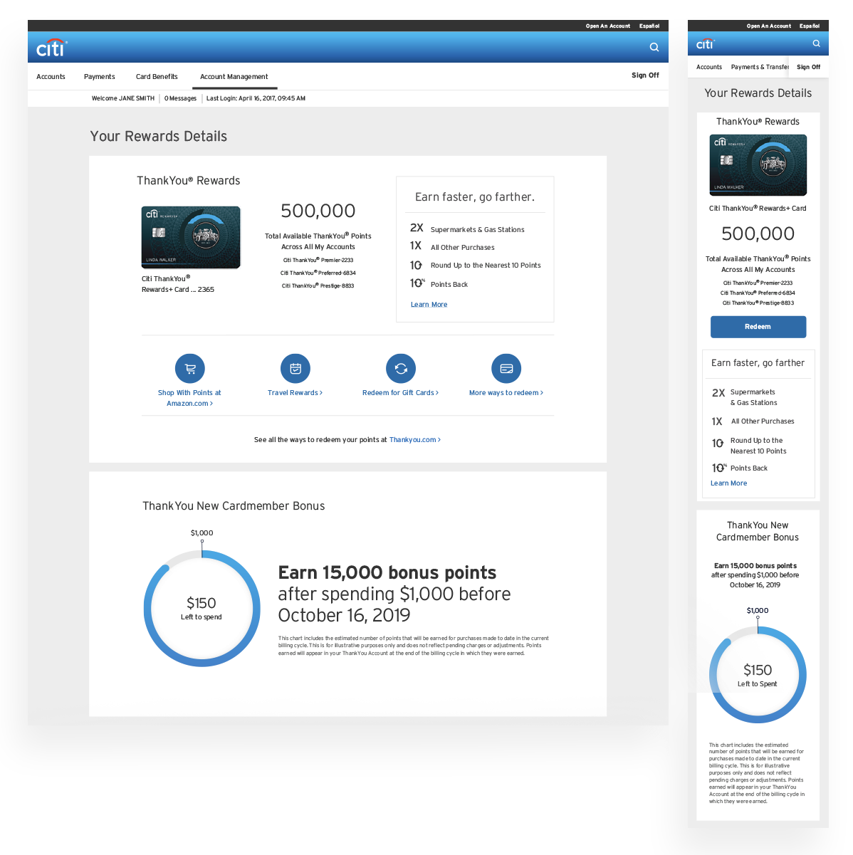
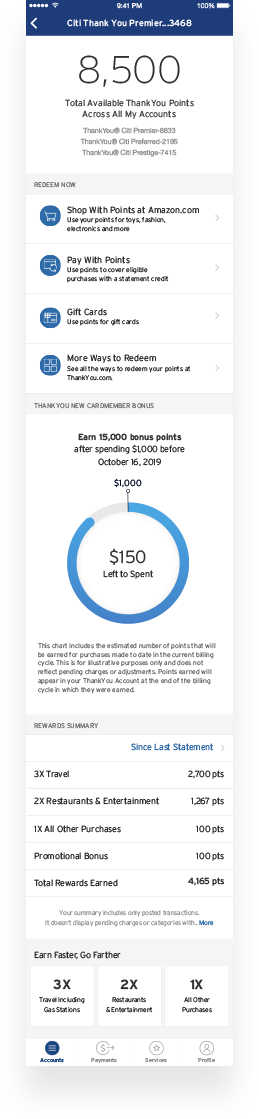
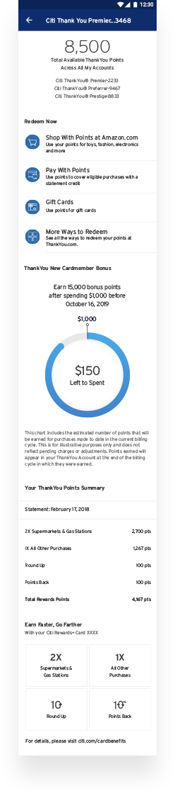
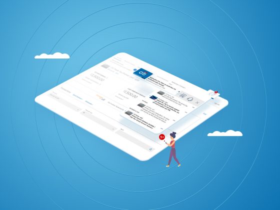
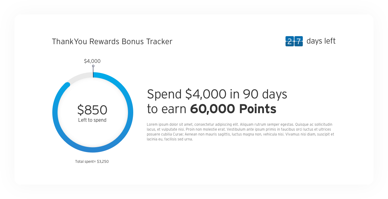
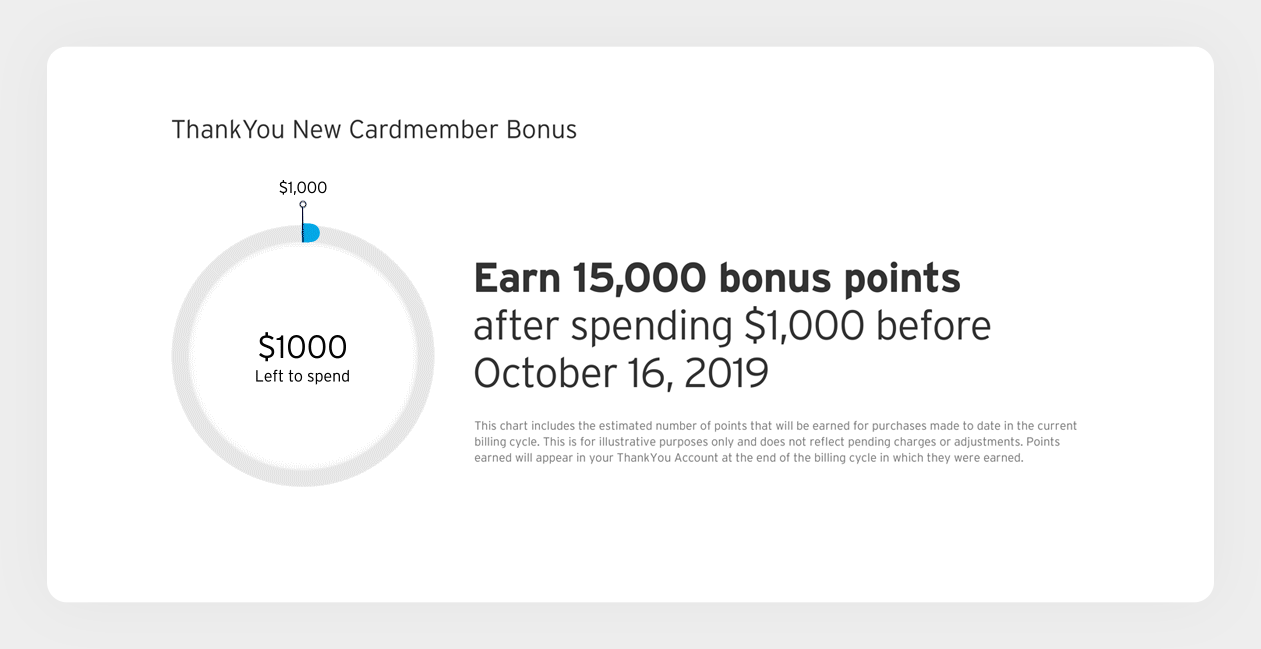
Citi offers an incentive (sign-up bonus) to all of its new ThankYou card customers after a certain task is completed. Usually that task is pending a certain amount of money with the card within a defined time frame (e.g., spend $4k in the first three months and receive an extra 60k Points).
We needed a way to visually show how far along the customer was on their journey towards earning the acquisition bonus offer.
Work
UX/UI
Animation
PLATTAFORM
iOS
Android
Browser
Mobile Tile
Client
Citi
Release Date
February 2020
To comply with my non-disclosure agreement, I have omitted and obfuscated confidential information in this case study.
All information in this case study is my own and does not necessarily reflect the views of Citi.
My Role
I was the UI designer behind the Citi acquisition bonus tracker between August 2019 and January 2020 and worked alongside a UX Copywriter for the majority life of the project.
In addition, I also worked with the mobile and browser scrum teams, a creative director and the product owner. I stopped working on the project as final assets and redlines were handed off.
Acquisition bonus tracker was release globally to all new Citi ThankYou Points card customer in February 2020.
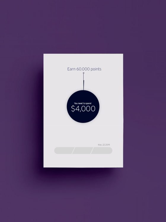
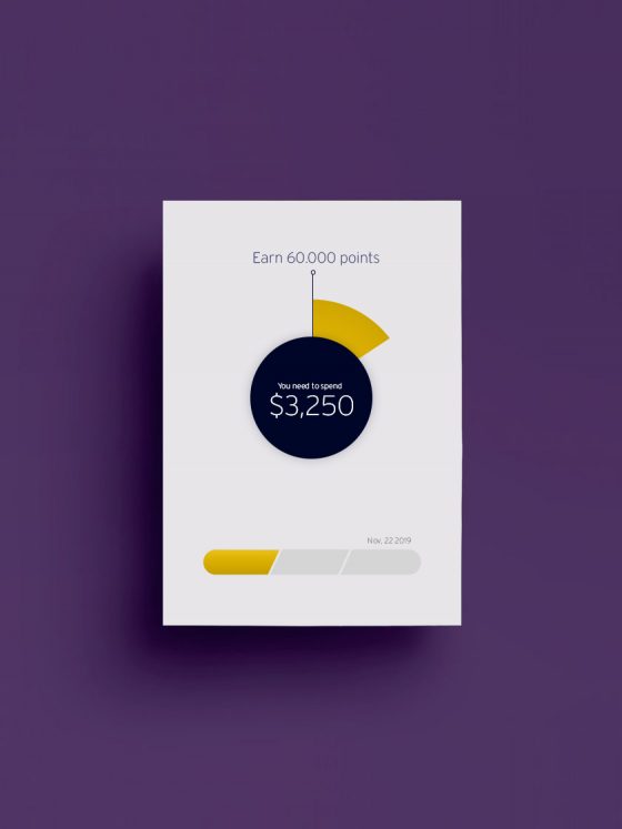
My Initial Designs
When assigned to this project I was given the opportunity to bring something new. One of the ideas behind bringing a designer from outside the rewards domain (in this case me) was to have someone with fresh eyes, and this was my first design concept.
My Initial Designs
When assigned to this project I was given the opportunity to bring something new. One of the ideas behind bringing a designer from outside the rewards domain (in this case me) was to have someone with fresh eyes, and this was my first design concept.
The Challenge
Our business goal on this project was to bring awareness to the acquisition bonus offer, and be upfront and clear to our users how close or far they were from reaching their acquisition bonus offer, meanwhile deflecting calls and empowering customers to reach their acquisition offer.
For me personally, the biggest challenge was doing it all in a simple but eye-catching single graph.
key measures for success:
Increase MRCs and deepen relationships.
Adding Complexity
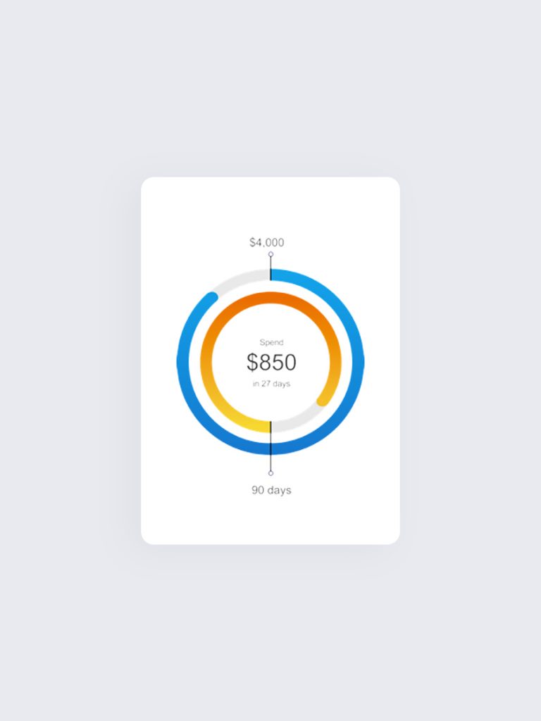
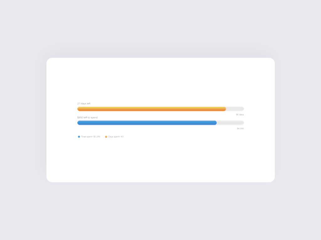
While my first concept was eye catching enough, it focused solely on the first part of an acquisition offer, “money spent”. But the second part, “time”, was just as important.
After our first business review our PO requested adding the visual cues for time as well as money spent.
After taking the feedback, I introduced some new and more complex features that focused on both time and money spent.
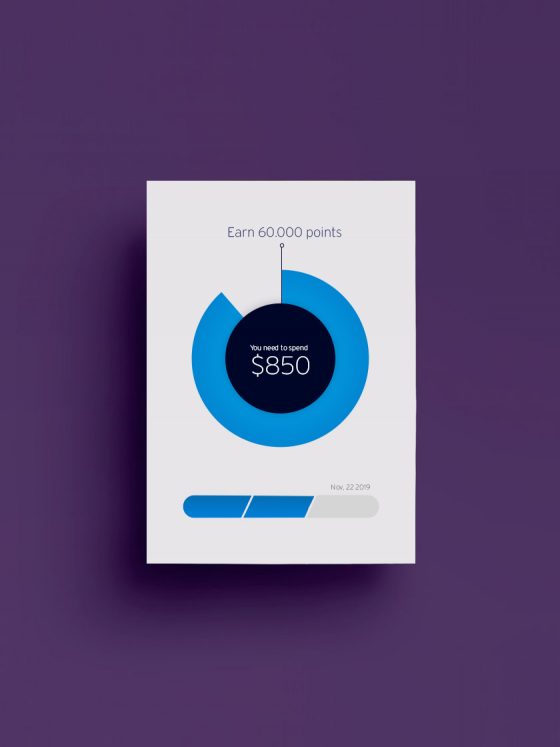
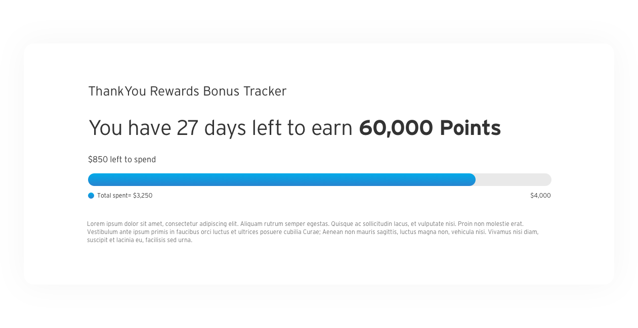
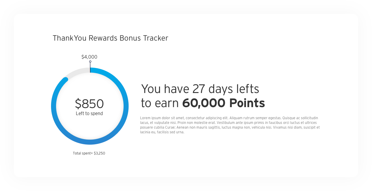
Back to the Basics
One of the options presented at the second business review featured a line graph, and the simplicity of the simple graph landed well with the business, so simplicity became the focus.
I partnered with a UX Copywriter who was already working on copy for this effort, and my idea was to cover the spending aspect with a graph and have the timing aspect served by copy.
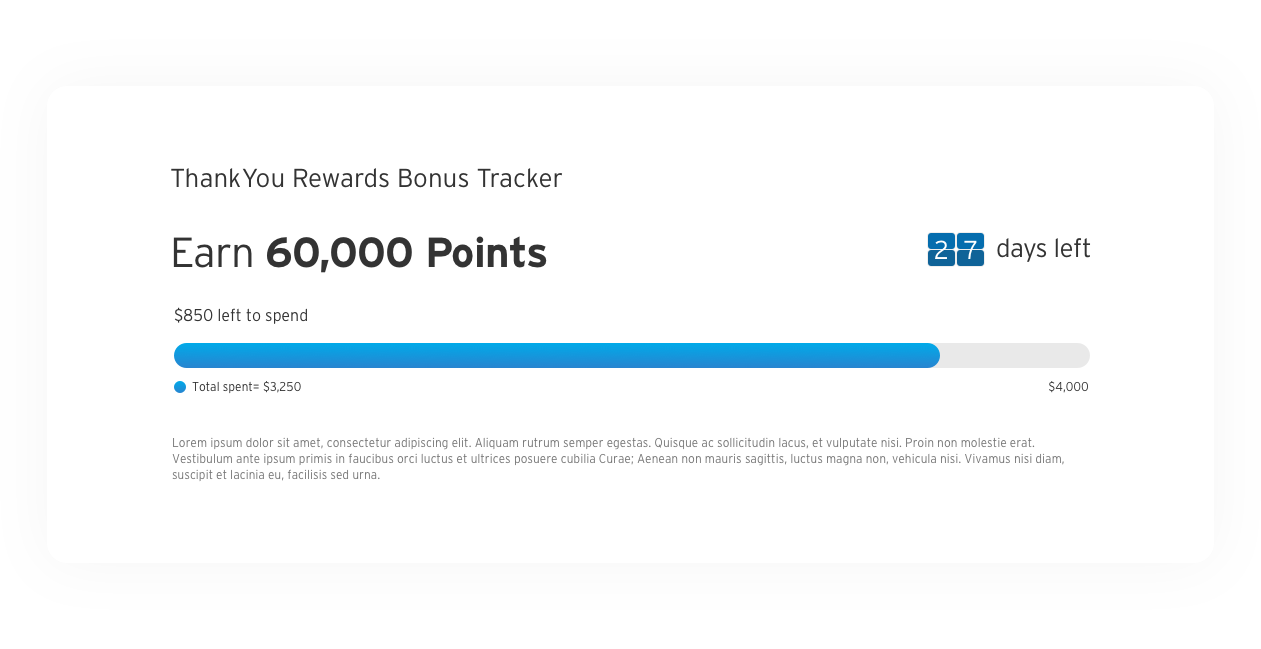
Adding a Sense of Urgency
After looking at the newly proposed designs, I felt there was a need to bring a sense of urgency, so alongside the top options I also presented two other small variations.
User Testing
– New York, December 2019
We brought in about 7 designs/concepts, for a full day of in-lab user testing.
These were not fully built prototypes but rather invision click thru.
The goal here was not to find a clear winner but to identify winning features, find pain points and discover which features our respondents found most useful and why.
Key Findings
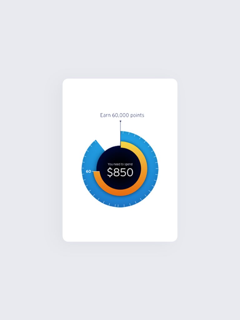
The idea of a bonus tracker was highly received by most.
Many found the combined graph (spend/time) very confusing at first, and some did not understand it at all.
The ones that did understand the combined graph found it to be the most useful.
The single one-line pie graph was the most preferable of all the options.
The majority of respondents wanted to see an actual date instead of how
many days were left, even though the “date flipping” was highly appreciated, as it did convey the matter of time sensitivity.
A Last Minute Change Shows an Opportunity
As I was getting ready to package files and finalize the project, a change in the system showed an opportunity to enhance the experience: the bonus tracker that was going to be updated once a month alongside a new statement, was now going to be able to receive real time data, and a whole new design wasn’t truly necessary. With some real time data now being fed to our graph, some motion could really kick the whole experience up a notch.
Maybe I did go a little overboard with the animations. I literally had over 12 animations done in less than 24 hours.
More Than Just Movement
Bringing motion to this project was more than just movement on a screen, and it took some time while working with our dev team to get it just right. The animation couldn’t be too short or it would lose it’s value, and it also couldn’t be too long or it would lose its power.
After some research, and some quick tests between co-workers and friends, I landed on a sweet spot of 5 seconds. It was also important to add ease-ease motion, because I wanted the animation to give the feeling of momentum.
EASE-EASE ON ANIMATION TO SHOW MOMENTUM AND EXCITEMENT
IN THE END A SIMPLE BUT EFFECTIVE SUCCESS ANIMATION
Final Design
Citi launched the new Acquisition Bonus Tracker on February, 2020 for all new ThankYou Premier Card Customers. The feature was highly praised by the business and currently there are talks of bringing the feature to other parts of the rewards system.